THE NEW ERA OF PEPPER.
The same Pepper zest you know and love, re-imagined and re-designed.
Creative Direction by Liv Ewing. Scope includes brand identity, web design, graphics refresh, and physical packaging. Brand strategy and identity was done in collaboration with Robin Kannard and Carol Chan.

TAKE UP SPACE
Call it a glow up—we’re more confident in who we are and what we’re all about than ever before. We’re on a mission to redefine body standards, and we’ve got a refreshed look to go with it. We can’t wait to show you what we have in store.
THE NEW IDENTITY
Allow us to (re)introduce ourselves. We’re Pepper! The brand behind the movement to not only embrace, but celebrate, small boobs. Because it’s time that body standards get redefined, and we’re here for it—with a refreshed look that better represents who and what we’re all about.
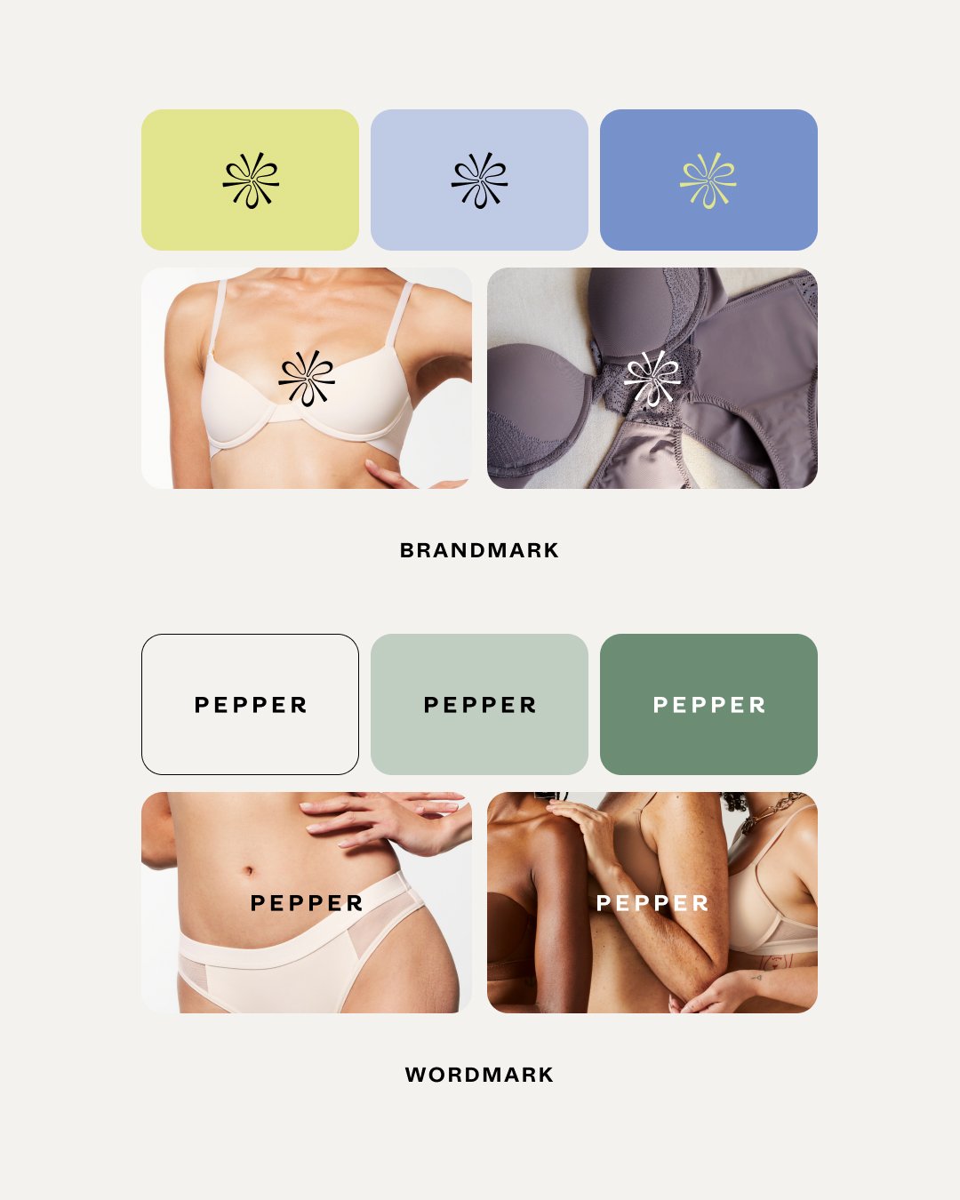
Our new logo is a refreshed version of the original — while our new icon is a fresh, new conceptual approach to a sliced pepper. The three chambers represent our three cup sizes, in a sweeping motion to reflect our brand tagline, Take Up Space.
A FRESH COLOR STORY
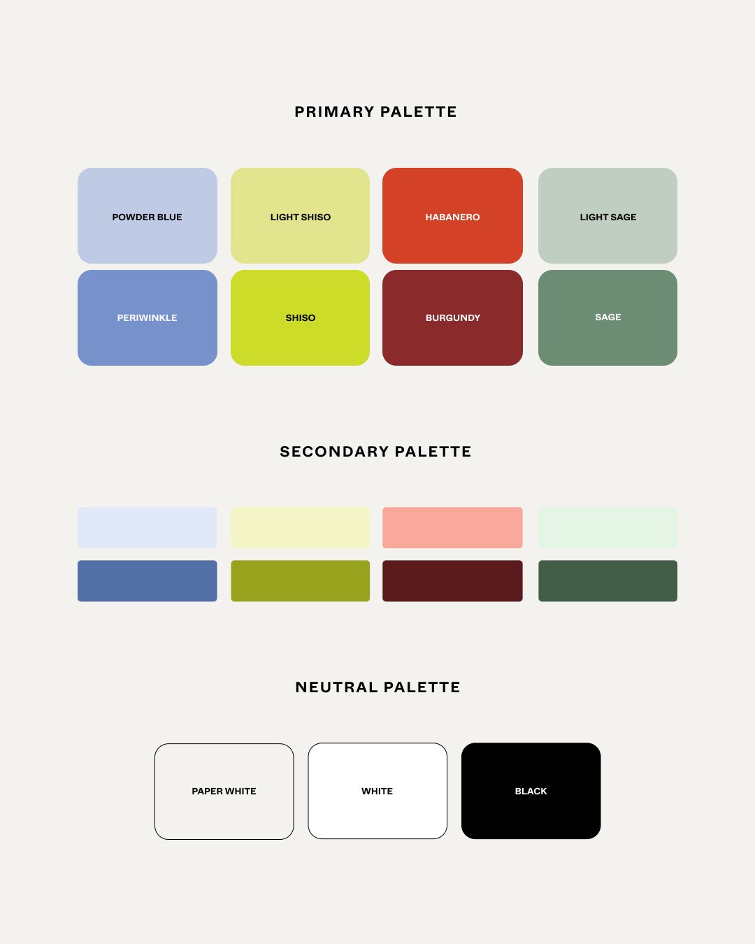
Our color story borrowed a periwinkle and shiso combination inspired from the original Pepper colors, lavender and shiso. We reassessed color, adding in some Pepper red tones and a sage green to create a bold and fluid color story.
NEW SITE CREATIVE
Our website refresh, including all new brand identity as well as new art direction on editorial and e-commerce PDP imagery. We updated type, color, buttons, stickers, and more.
New packaging
Our new packaging suite entails new garment tags, a new unboxing experience, and new creative marketing assets in the packages. More images of the full suite available on request.


